Naviance UX Writing Analysis
Naviance is an American college and career readiness software provider that partners with high schools and other K–12 institutions to provide students with college planning and career assessment tools.
Analysis
Accessible: Refining my college search in a series of popups is a bit awkward. The features and functionality is not clear, nor do I know where I am in the workflow.
Purposeful: The homepage leaves me wondering what I should do first.
The search results page has duplicate CTAs, sand ome buttons are grayed out. Like the homepage, it isn’t clear to me what I should do first.Conversational: There are many titles in the throughout the workflow, but often further explanation would be helpful to understanding what I can do and expect.
Concise: There are many instances of duplicate titles, and sometimes buttons.
There are times where a short string is all that is needed.Clear: I’d really like to clean up the usage of ‘Criteria’ on the search page. ‘Your Fit Criteria’ and ‘Must Haves’ and ‘Nice to Haves’ all need to be aligned and titled so they are connected, and not separate things.
Recommendations
Accessible: Simplify UI and guide users so they may understand the workflow, and gauge the number remaining steps.
Purposeful: On the home page, convey the three most important tools available to a student; not just college search. Suggest a useful or logical order to perusing the website.
Simplify the search page when no criteria have been selected.
Eliminate confusing and empty messaging.Conversational: Titles of pages leave users confused. Add descriptions on the home page and the search home page.
Concise: Identify duplicated content, and simplify to a single instance.
Offer a single point of entry for search. Add functionality to the search function by adding filters and sorting methods.Clear: Put a link to Single Sign On below the standard email and password login
Consider using radio buttons instead for the Greek Housing; there are only three options.
instead of listing a ‘Doesn’t Matter’ option for sport types, use check boxes so that a user can select all or some of the options
Be specific about the ‘On Campus Housing’ checkbox. Even if it simply means ‘The school offers on campus housing.
Be specific what ‘high percentage’ means. More than 5%, 50%?
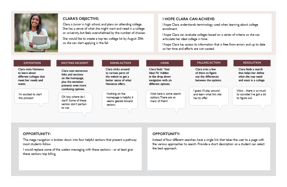
User Persona
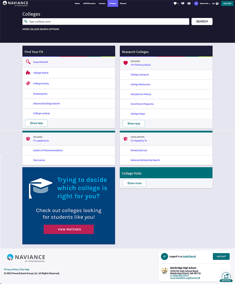
Home page can be improved by adding content that helps a student know where to begin. The mega menu does a nice job of sectioning content in a way to orient someone in their college search journey.
There are at least four ways to conduct a search. I would combine the 1 and 2 since they really the same thing just presently slightly differently (College Search). If the addition of filters and sorting were introduced, 3 and 4 could also be combined (College Compare).
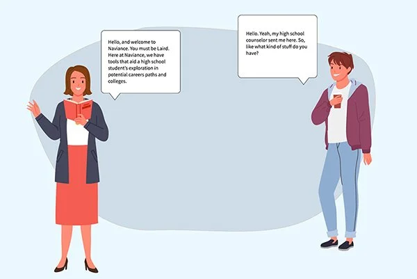
Conversation as Design
Using a comic strip format, this steps aims to illustrate how an onboarding experience would work if the experience was a person.

Tailor Text to New Users
Simplify the homepage with fewer links within each of the main sections, and add short, descriptive text to convey to new users the features of Naviance.
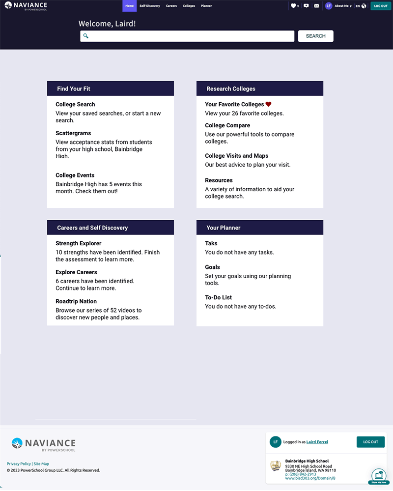
Add Meta Data for Returning Users
Students have access to Naviance for two to three years.
Use available meta data to personalize the students experience and better reflect their past actions.